
1. The Button widget has nine presets and allows you to create custom presets
Click "Add" to create a custom preset

Custom Presets
2. Specify the name for the Custom Preset, select a Font and Font Style for the Button

3. Specify the Border for the Button, select a Border Style, and specify the Width and Corners

4. Select an icon for the Button. You can select a Font Awesome icon or select the image as an icon

5. Specify the Icon position. You can set it to be at the top, bottom, left, or right

6. If you need to pin the icon to the Background of the Button, use the corresponding checkbox

7. Select "Enable Divider" to add a divider between the icon and button text

8. Specify the Style for the Divider. It can be solid, dashed, or dotted.
Additionally, specify the size of the divider, its thickness, and the space from the Icon

9. Select the "Full Width" checkbox if you need the Button to stretch in full width

10. The "S", "M", and "L" tabs are for configuring sizes and spacing for the small, medium, and large Button sizes. The Button size can be selected when you edit the Button Widget in the Pages section. Please refer to this guide for more details

11. You can also copy the size and spacing values by clicking "Copy from S Size" or "Copy from M Size". This is present in all sizes

12. You can configure the following values for each Button size: Font Size, Letter Spacing, Top Padding, Right Padding, Bottom Padding, Left Padding, Minimal Width
Font Size - allows you to set the font size for Button text
Letter Spacing - allows you to set the spacing between letters for the Button text
Padding - allows you to set spacing around the Button widget
Minimal Width - allows you to set the minimal width for the button, which can be set up to 300 pixels

13. You can also adjust icon sizes and spacing. You can configure the following values for the icon: Icon Size, Spacing Between Icon and Text, Icon's Background Width, and Icon's Background Height

14. Use Normal and Hover State buttons to set the color for Normal and Hover states for Button, Icon, Divider (if it's enabled), and Shadow colors
If you need a specific color, use the Color Picker
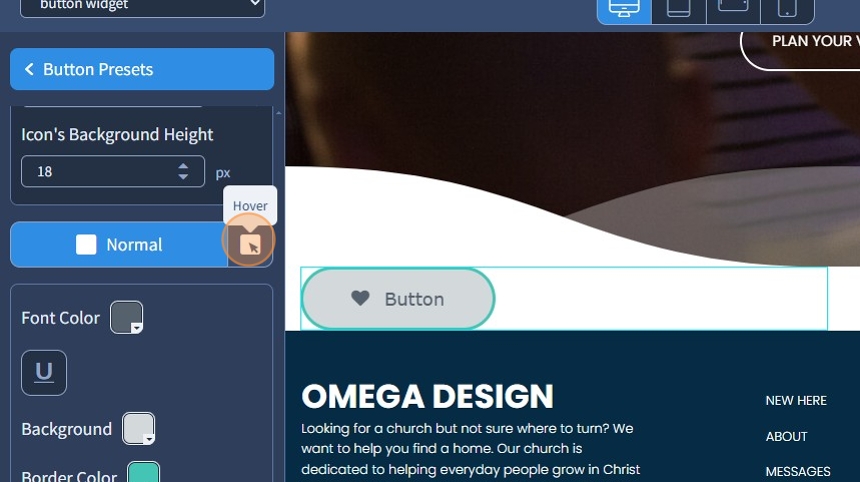
15. Specify the Font Color, Background, and Border Color for the Button

16. Specify the Icon Color and Icon Background color

17. If needed, add an Outset shadow. Specify X, and Y offsets, Blur, and Spread for the shadow. Additionally, specify the color

18. If needed, add an Inset shadow. Specify X, and Y offsets, Blur, and Spread for the shadow. Additionally, specify the color. If you need a specific color, use the Color Picker

19. If you need to reset the settings to the default for the preset, use the corresponding button

20. Click the "Save" button to confirm the changes

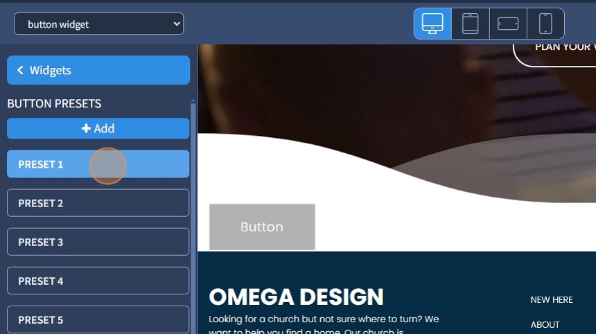
Regular Presets
21. The Button widget has nine regular presets. Select Preset 1
22. Select Font and Font Style for the Button

23. Use Normal and Hover State buttons to set the color for Normal and Hover states
Set the color for Font Color, Background, and Border Color, and specify if the text needs to be underlined

24. Specify the Font Color, Background, and Border Color. Use the "U" icon to underline the text. If you need a specific color, use the Color Picker

25. Click the "Save" button to confirm the changes
