
1. An accordion is a widget that allows users to expand and collapse sections of content, making the page less cluttered and easier to navigate. It is most frequently used in the FAQ sections on the site. To use an accordion widget, drag and drop it onto the page.

2. Left-click the Accordion widget to edit the Settings described in Step 3 and further

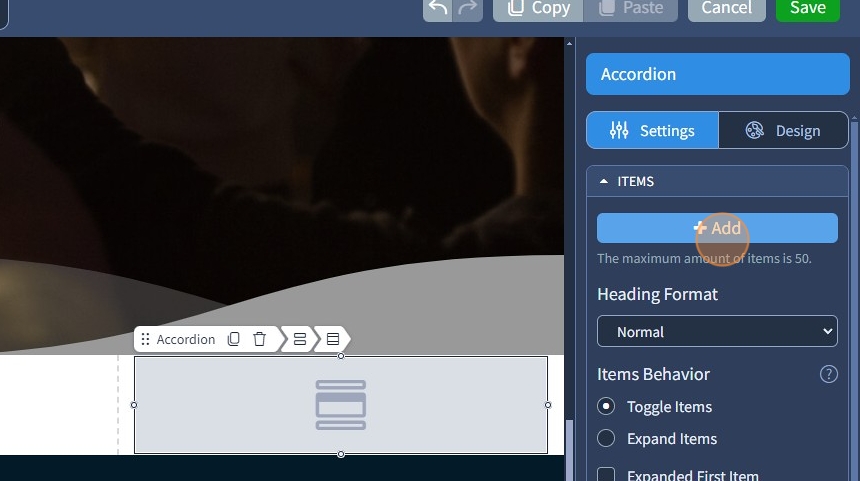
3. Click "Add" to add an Accordion item
4. Specify the Accordion item title

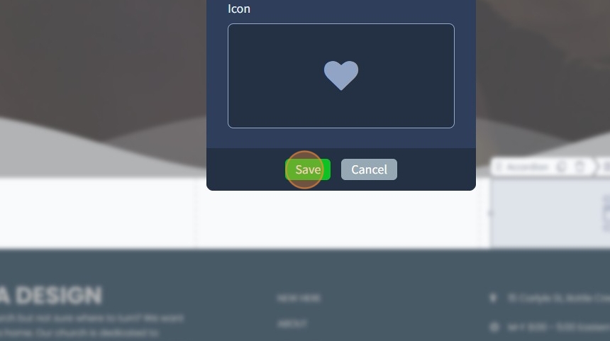
5. Select an icon or an image for the Accordion item

6. Click "Save" to confirm the changes
7. Click the pencil icon to edit the content of an Accordion item

8. Drag and drop widgets on the Accordion item. You can use the following widgets: Row, Text, Image, Button, Divider, Space, Contact Form, Slider, Grid Gallery, Carousel Slider, Tile Gallery, Social Links, Video Player, Audio Player, Advanced Image, Google Map, Mailchimp, Progress Bar, Circular Progress Bar, Embed

9. Fill in the Accordion item with content

10. Click "Apply" to confirm the changes

11. Click the gear icon if you need to update the accordion item title and accordion item icon/image

12. Click the duplicate icon to duplicate an Accordion item.

13. To delete an Accordion item, use the bin icon.

14. Select the Heading Format. The following options are available: Normal, H2, H3, H4
H2, H3, and H4 are the heading tags that can be used for SEO.

15. The Items Behavior changes the accordion behavior. All items can be toggled one by one or expanded at the same time.

16. If you need the first item to be expanded by default, use the corresponding checkbox

17. If you need to not show the open/close icons, use the corresponding checkbox

18. Use the Icons Alignment to set Open/Close icons left or right.

The rest of the features here - Spacing, Visible On, and Animation, are common features in most widgets in the website builder. Please refer to this guide for more information on these features.
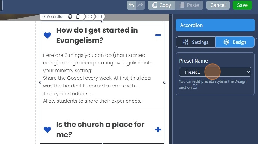
19. Switch to the Design tab

20. Select a Preset for the Accordion widget. Presets are predefined designs that allow users to quickly apply a specific style or layout to a widget. You can customize the preset style in the Design section
21. Click "Save" to confirm the changes
