
1. A circular progress bar widget is a circular visual indicator that shows the status of a task. It helps users understand how much of the task has been completed and how much is left. It provides a visual cue that signifies progression towards a goal. Drag and drop the Circular Progress Bar widget onto the page.

2. Select the Circular Progress Bar widget to edit the Settings described in Step 3 and further

Settings tab
3. Enabled the "Fixed Width" checkbox for Circular Progress Bar to have a fixed width. Specify the fixed width value in pixels

4. Specify the title for the Circular Progress Bar

5. Specify the position for the title. The following options are available:
Top - the title is positioned at the top
Before Value - the title is positioned before the % value
After Value - the title is positioned after the % value
Bottom - the title is positioned at the bottom

6. Specify the spacing for the title. Spacing is a common feature in most widgets in the website builder. Please refer to this guide for more information on spacing

7. Specify the % value for the Circular Progress Bar

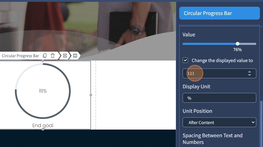
8. Enable the "Change the displayed value to" checkbox to enter a different numerical value for the Circular Progress Bar

9. Enter the new displayed value. The displayed value is changed to 111%. However, the progress bar itself is still at 76%, which allows more flexibility with Circular Progress Bars.
10. Specify the display unit. This field can also be empty as an option

11. Specify Unit Position. The following options are available:
After Content - the percentage is positioned after the value
Before Content - the percentage is positioned before the value

12. Specify the spacing between text and numbers. Spacing is a common feature in most widgets in the website builder. Please refer to this guide for more information on spacing.
Additionally, you can specify Vertical Alignment for the % unit. It can be the top, middle, or bottom. The Vertical Alignment will only work if the % unit has a Text Style with a smaller font size than the Text Style in the numerical value

The remaining features here - Spacing, Devices, Alignment, and Visible On are common features in most widgets in the website builder. Please refer to this guide for more information on these features
Design tab
13. Select the "Design" tab

14. Select a Text Style for the Title. Additionally, you can specify the Progress Text Style and the Unit Text Style

15. If needed, the Text Style appearance can be changed by clicking the pencil icon. Please refer to this guide for Text Style overview.

16. Specify the width for the Circular Progress Bar

17. Specify the color for the Circular Progress Bar. Please refer to this guide on how to select a specific color with the Color Picker

18. Specify the width for the progress bar range

19. Specify the color for the progress bar range
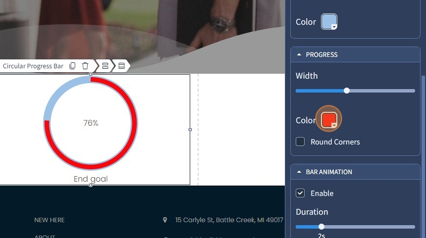
20. Select the "Round Corners" checkbox to make the progress bar range rounded

21. Enable bar animation with the corresponding checkbox so the Circular Progress Bar is not static

22. Specify the duration of the animation

23. Enable value animation with the corresponding checkbox so the Circular Progress Bar value is not static

24. Specify the duration of the animation

25. Click "Save" for the changes to reflect on the page
