
1. A progress bar widget is a visual indicator that shows the status of a task, helping users understand how much of the task has been completed and how much is left. It provides a visual cue that signifies progression towards a goal. Select the Progress Bar widget.

Settings tab
2. Click "Add" to add an item for the Progress Bar

3. Specify a title for the Progress Bar

4. Set the Progress Value for the Progress Bar

5. Enable the "Change the displayed value to" checkbox to show your end value instead of the % value.

6. Specify the end value

7. If enabled, this is how it can look on the preview. The end value is specified as "end"

8. If disabled, this is how it will look on the preview. The end value will inherit the Progress Value, which is 60% in our example.

9. Specify a background color

10. Select one of the main colors. The main colors section generates 5 additional colors for each vertical line, depending on the main color’s brightness settings. The 5 colors are based on the default design in the admin panel.

11. If needed, set transparency for color

12. If needed, choose a more specific color with "More Colors". To select an exact color, use the Color Picker feature. Please refer to this guide that explains how the Color Picker works and other common features in the website builder

13. Specify the Progress Bar color

14. Specify the Border Color

15. If needed, the border color can be cleared with the arrow icon

16. Click "Save" to confirm the changes

17. This is how it will look on the preview. The Progress Bar range has a turquoise color and a blue background

The remaining features here - Spacing, Visible On, and Animation are common in most widgets in the website builder. Please refer to this guide for more information on these features
Design tab
18. Select the "Design" tab

19. Select a Text Style for the title

20. If needed, the Text Style appearance can be changed by clicking the pencil icon. Please refer to this guide for Text Style overview.

21. Select the Text Style for the Progress value

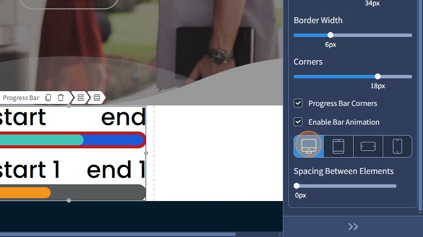
22. Specify the bar height for the Progress Bar

23. Specify the border width for the Progress Bar

24. Specify the corners for the Progress Bar

25. This is how it will look on the preview. The start and end values have corners now, they're also using the Text Styles we have specified, as well as Bar Height and Border Width

26. Enable the "Progress Bar Corners" checkbox to make the Progress and Background colors rounded inside the Progress Bar

27. If enabled, the colors inside the Progress Bar are also rounded

28. If disabled, the colors inside the Progress Bar are not rounded

29. Enable bar animation with the corresponding checkbox so the Progress Bar is not static

30. If there's more than one item, select a device that should have spacing between elements. The Devices is a common feature in most widgets in the website builder. Please refer to this guide for more information.
31. Specify the spacing between elements

32. This is how it will look on the live preview. The Progress Bars have a spacing between them

33. Click "Save" for the changes to reflect on the page
