
1. Tabs are used to organize content into separate sections, making it easy for users to navigate between them without leaving the page. Each tab usually represents a different category or piece of information, and clicking on a tab reveals the corresponding content while hiding the others. This helps keep the page clean and prevents overwhelming the user with too much information at once. Drag and drop the Tabs widget on the page
2. Left-click the Tabs widget to edit the Settings described in Step 3 and further

3. Click "Add" to add a Tabs item

4. Specify the Tabs item title

5. Select an icon or an image for the Tabs item

6. Click "Save" to confirm the changes

7. Click the pencil icon to edit the content of a Tabs item.

8. Drag and drop widgets on the Tabs item. You can use the following widgets: Row, Text, Image, Button, Divider, Space, Contact Form, Slider, Grid Gallery, Carousel SLider, Tile Gallery, Social Links, Video Player, Audio Player, Advanced Image, Google Map, Mailchimp, Countdown Timer, Progress Bar, Circular Progress Bar, PayPal Button, Embed widget

9. Fill in the Tabs item with content

10. Click "Apply" to confirm the changes

11. Click the gear icon if you need to update the tabs title and tabs item icon/image.
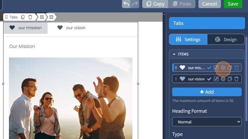
12. Click the duplicate icon to duplicate a Tabs item. To delete a duplicate Tabs item, use the bin icon

13. Select the Heading Format. The following options are available: Normal, H2, H3, H4
H2, H3, and H4 are the heading tags that can be used for SEO.

14. The horizontal tab is the default type. The tabs will be located above the content

15. Specify the title alignment. Left, center, and right options are available.

16. Specify the alignment of the icons. Left or right options are available.

17. Select Justified Titles to stretch titles through the entire widget's width.

18. Select the vertical type of tabs. The tabs will be located left or right of the content
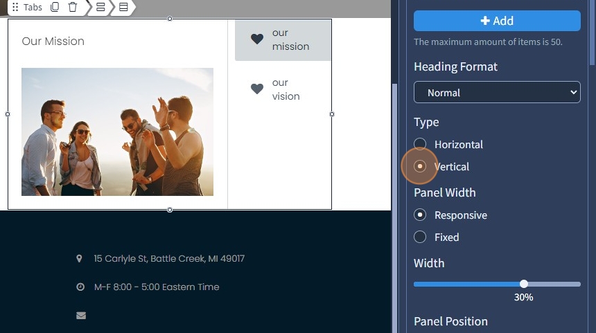
19. Specify Panel Width type. It can be responsive or fixed

20. Specify panel width. For responsive, it is set to percentages, and for fixed, it is set to pixels

21. Specify Panel Position. It can be left or right

22. Specify the Title text alignment. Left, center, and right options are available

23. Specify the alignment of the icons. Left or right options are available.

The rest of the features here - Tabs Animation, Spacing, Visible On, and Animation, are common features in most widgets in the website builder. Please refer to this guide for more information on these features.
24. Switch to the Design tab

25. Select a Preset for the Tabs widget. Presets are predefined designs that allow users to quickly apply a specific style or layout to a widget. You can customize the preset style in the Design section

26. Click "Save" to confirm the changes
