
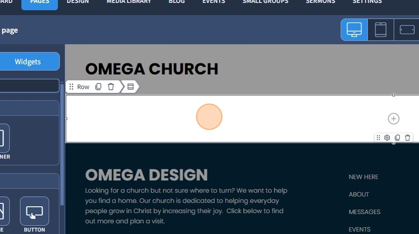
1. Drag and drop the "Row" widget to where it should be.

2. Select the Row widget to edit the Settings described in Step 3 and further
3. You can choose between two types of widths: "Fluid" and "Fixed"
"Fluid" is the default width type. It occupies 100% of the section width. The section occupies 100% of the screen width.
"Fixed" is a width type that sets a fixed widget width and creates small gaps on either side of the Row widget.

If you place a Row inside the Main Row, the width is still adjusted in the Main Row
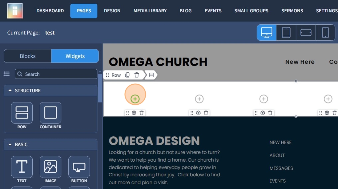
4. "Row Structure" - allows the "Row" widget to be divided into columns (up to 6). One column is used by default.

5. Each of the 6 switch buttons divides the width of the section into columns. All columns have the same width.

6. "Equal Column Width" - allows you to make the width of all columns the same, which will align the content within them accordingly.

7. "Vertical Alignment" - allows you to specify the type of content alignment in the columns of a row. The available options depend on the maximum column height, which affects the alignment of all other objects within the "Row".

8. "Grid Behavior" - influences how the grid functions on mobile devices, determining whether columns will align in a horizontal row or stack vertically on top of one another. This behavior may also apply to tablet devices, where columns can group vertically as well.

9. To add a widget to a column, you can use "Simplified Editing".
You can learn more about "Simplified Editing" in this guide.
You can also drag and drop the widget you want into a column from the list of widgets on the left.
10. Go to the "Design" section to customize the design of the widget.

11. Click here to change the background color.

12. Click on the "+" icon to add a picture as a background.

13. The "Video (.mp4)" field allows you to add a .mp4 video as a background.
The "Video (.webm)" field allows you to add a .webm video as a background.

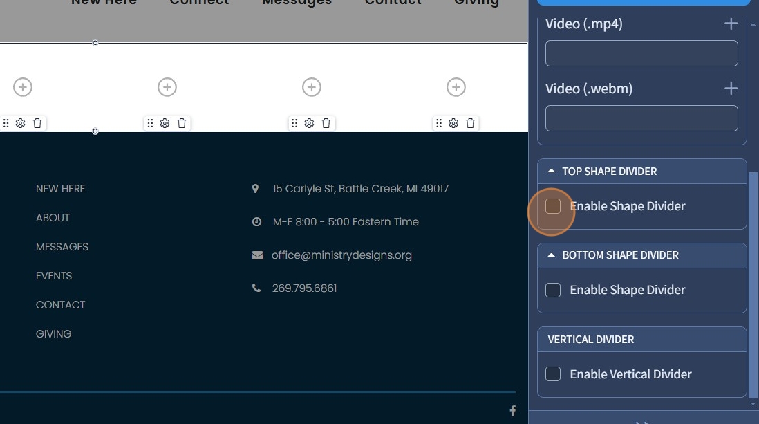
14. The "Top Shape Divider" and "Bottom Shape Divider" features allow you to add a specific shape to your Row widget to make it more attractive.
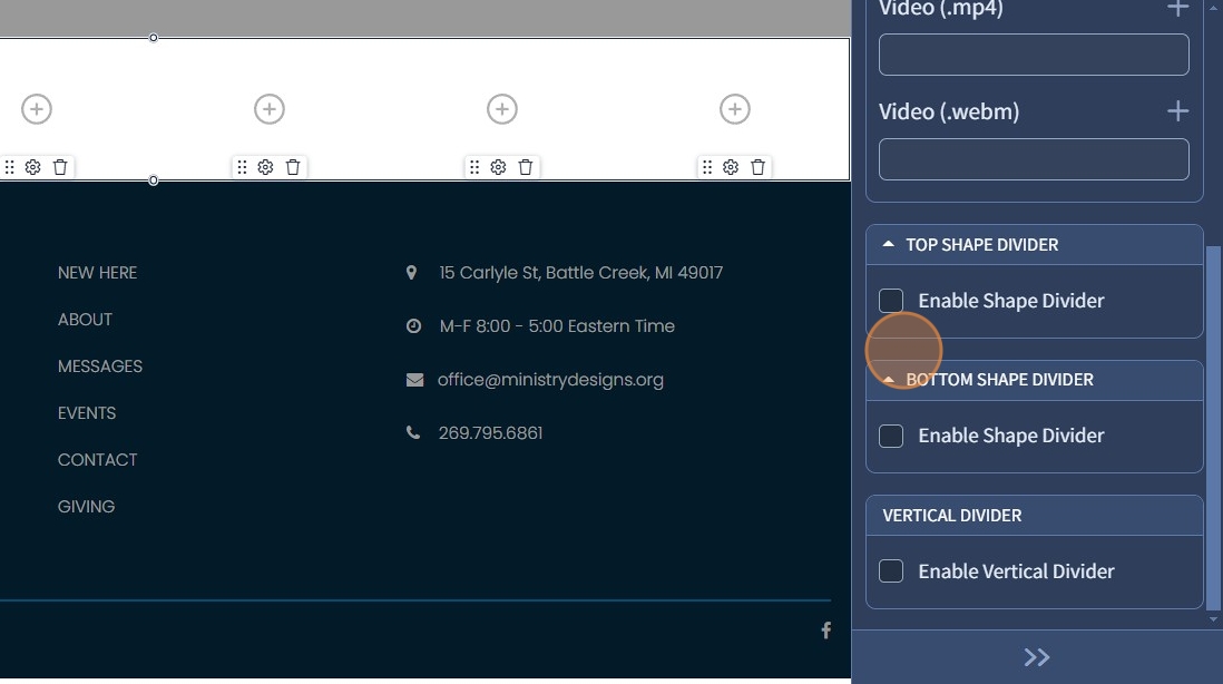
15. The "Enable Shape Divider" checkbox activates additional settings.
16. "Shapes" - allows you to select an available shape from the list which can be applied to the Row widget.
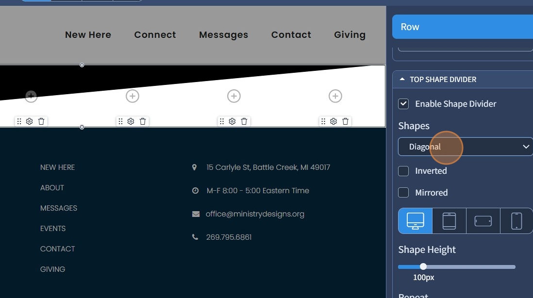
17. The "Inverted" function changes the visible effect of the figure, creating an inverted state.

18. The "Mirrored" function changes the visible effect of the shape, making it mirror-like.

19. "Shape Height" affects the visible height of the shape in the Row widget area.

20. "Repeat" creates additional copies of the shape in the Row widget area from left to right.

21. "Opacity" allows you to adjust the transparency of the shape separators.

22. "Shape Color" changes the color of the superimposed shape.
"Position" allows you to position the form above or below the content.

23. Click the "Save" button when you are finished editing.
