
Container
1. The Container Widget groups multiple widgets together, helping to organize content and apply shared styles or settings to all widgets inside it. Drag and drop the Container Widget onto the page.

Adding Image or Video
2. Drag and drop widgets from the left-side panel or click "+" to quickly add widgets like Image or Video with Simplified Editing

Editing the margin and padding
3. Switch back to Container via the Widgets Tree and specify Margin and Padding.
Margin controls the space outside the container, creating distance from other elements.
Padding controls the space inside the container, adding spacing between its content and the container’s border.

4. If needed, specify an Anchor for the Container. An Anchor is a link that points to a particular part of a page

5. Select the "Sticky" checkbox. If enabled, the widget will be visible until you scroll to its top side. Once this is done, the widget will be visible and will stick to the top side of the screen when scrolling. "Sticky on Mobile" does the same on mobile devices

6. Select the "Adjust to Fit the Screen Height" checkbox. When this property is enabled, the minimum height of the widget will be equal to the height of the visible screen area.

The rest of the features here - Vertical Alignment and Visible on are common features in most widgets in the website builder. Please refer to this guide for their description.
7. Switch to the Design tab.

Background Type - Color
8. There are four Background Types in the Container Widget:
- Color – Set a solid background color.
- Image – Add an image as the background.
- Gradient – Apply a smooth transition between colors.
- Multibackground – Combine multiple background layers for advanced styling.
You can also set a Background Video as an alternative when editing each Background Type.

9. Set the Background Color and Alternative Sticky Color (used for the Sticky effect). To reset the color, click the arrow next to it.

Adding background video
10. Alternatively, you can add a Background Video. Click the "+" icon to add videos from the Media Library. To make the video background cross-browser compatible, both video formats, .mp4, and .webm, should be used.

11. Click the pencil icon if you need to change the video or the bin icon if you want to delete it. Specify the video position and select the "Loop" checkbox if the video should be looped

You can add video as a background regardless of what Background Type you're editing.
Background Type - Image
12. Click "+" to add a Background Image

13. If needed, click the pencil icon to change the image or the bin icon to delete it. Specify Image Size and Image Tile.
Image Size in Background Type: The image controls how the image fits within the container:
- Original – Displays the image at its original size.
- Cover – Scales the image to cover the container fully while maintaining the aspect ratio.
- Contain – Scales the image to fit within the container without cropping.

14. Image Tile determines how the image repeats:
- Don't Repeat – Displays the image once.
- Repeat – Tiles the image both horizontally and vertically.
- Repeat X – Tiles the image horizontally.
- Repeat Y – Tiles the image vertically.

Image Tile does not work with Cover because Cover scales the image to fully cover the container, leaving no space for tiling. It only works with Original and Contain where excess space remains.
15. Specify the "Fixed" or "Parallax" effect for the Background Image.
The Fixed effect keeps the background image stationary while scrolling, creating a sense of depth.
The Parallax effect makes the background image move at a different speed than the foreground content when scrolling, creating a dynamic, 3D-like effect.

Background Type - Gradient
16. Specify the colors for the Gradient. To select a specific color, use the Color Picker
Additionally, specify Gradient Direction

Background Type - Multibackground
17. Click "Add" to add items for Multibackground. The maximum amount of items is 10

18. Select from the dropdown what Item Type it should be. Four options are available: Color, Image, Gradient, Video

19. Click the gear icon to edit/change items, click the duplicate icon to create a copy of the item, and click the bin icon if you need to delete the item
Drag and drop items upwards or downwards to change the order of how layers are displayed

For a more detailed description of layered backgrounds, please refer to this guide.
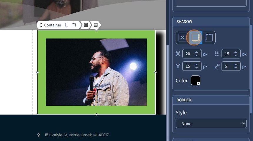
Adding shadow
20. You can set an Outset or an Inset Shadow. Specify the X offset, Y offset, Blur, and Spread for the shadow. Additionally, if needed, change the color of the shadow
Adding border
21. You can specify a border for the Container (Solid, Dashed, or Dotted). Specify the color and width of the border

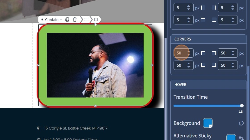
Adding corners
22. You can specify corners for the container and make it rounded. Specify corners for all sides
Hover
23. A hover effect changes how an element looks when someone moves their mouse over it. You can set a different hover color for the Background, Alternative Sticky Color, Border, and Shadow. Adjust shadow settings if needed.

24. Click "Save" to confirm the changes
