
1. The Filters widget helps visitors quickly find specific posts by narrowing down the displayed content based on certain criteria. Drag and drop the filters widget on the page

2. Select the Filters widget to edit the Settings described further

3. If needed, specify an anchor in the Filters widget. An anchor is a link that allows users to jump directly to a specific section

4. By default, the Filters widget jumps to the anchor in the Row widget that has the Small Groups Post List widget

5. You can see that it has an anchor with the same name. The Filters widget will jump to this Row when applying a filter

6. The Filter Categories section shows the current taxonomies you have created for the Small Groups. You can hide the taxonomies you don't need to be shown by clicking the eye icon
The search via the Filters widget is done by selecting existing categories and tags from the taxonomies. The categories and tags should be assigned to the Small Groups Posts so they're displayed in the Filters results
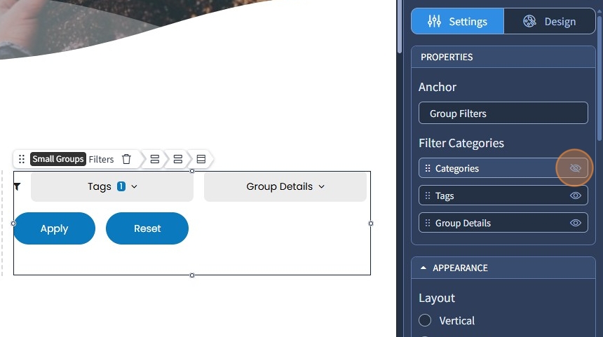
7. You can also change the order of the Filter Categories items by dragging and dropping them upwards or downwards

8. Specify the Filters layout. It can be vertical or horizontal

9. Specify the appearance type for the Filters widget. The following options are available:
Dropdown - This saves space on the page by hiding the filter options until they are clicked.
Accordion - allows multiple filters to expand or collapse individually.
Always Open - displays all filter options upfront without requiring user interaction to expand.

10. Specify the spacing between the elements. The following options are available: 0, Small, Medium, Large

11. Additionally, if you have selected a horizontal layout for the Filters widget, you can configure the alignment of the filter items

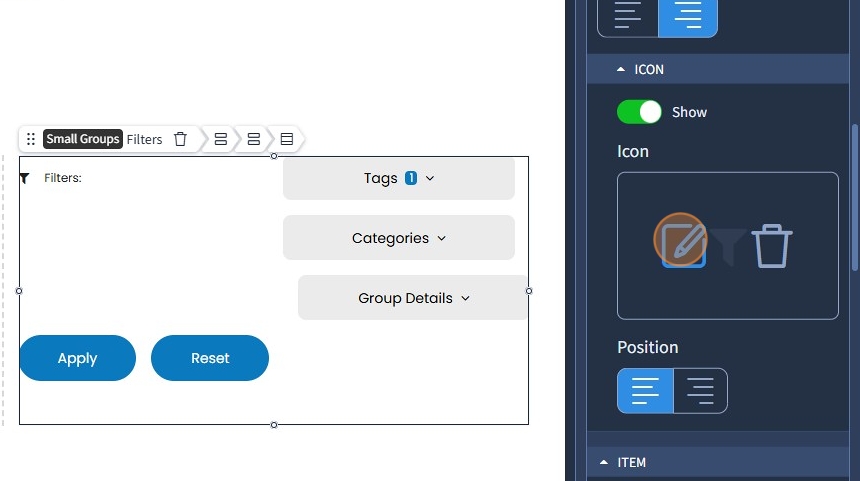
12. Click the toggle button to show the label. If needed, rename the label to something else and specify its position

13. If you have selected the vertical layout for the Filters widget, besides position, you can also configure the alignment of the label. Click Device icons to set the alignment of the label on each screen resolution

14. Click the pencil icon to change the label icon. If you need to delete it, click the bin icon. Additionally, you can show or hide the icon with the respective toggle button and set the position of the icon to be left or right
15. Click the pencil icon to change the toggle icon for filter items. If you need to delete it, click the bin icon. Additionally, click device icons to set the alignment of the toggle icon on each screen resolution

16. If you have set the layout of the Filters widget to horizontal, you can also specify how much width the filter items should take

17. Specify the layout for the buttons in the Filters widget. The following options are available: Inherited, Vertical, Horizontal
Inherited - adopts the layout you have specified for the Filters widget;
You can also specify the spacing between the elements. The following options are available: 0, Small, Medium, Large
Lastly, if you need to, you can click the device icons to set the Alignment of the buttons on each screen resolutions

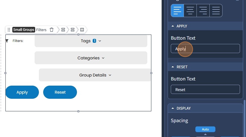
18. If needed, you can rename the "Apply" and "Reset" buttons in the corresponding fields
The rest of the features here - Spacing, Visible On, and Animation are common features in most widgets in the website builder. Please refer to this guide for more information on these features.
19. Switch to the Design tab
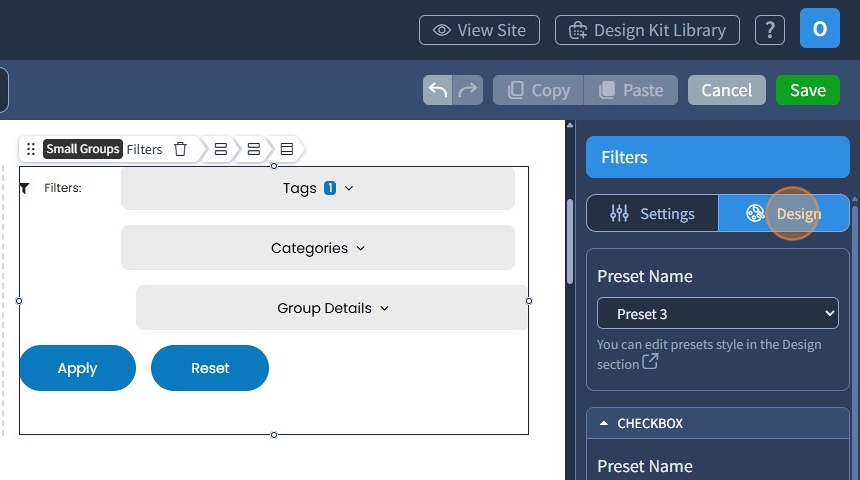
20. Select a Preset for the Filters widget and checkboxes from the dropdown. Presets are predefined designs that allow users to quickly apply a specific style or layout to a widget. You can customize the preset style in the Design section

21. You can also select presets for the buttons and specify button sizes (Small, Medium, or Large)

22. Click "Save" to confirm the changes
