
1. A contact form is a web form that allows website visitors to send you messages or inquiries. It typically includes fields for the visitor's name, email address, message, etc. Drag and drop the Contact Form widget on the page.

2. Left-click the Contact Form widget to edit the Settings described in Step 3 and further

3. Specify an email in the "Email to" field that should receive submissions from the Contact Form. If you include several emails, separate them with a comma and a space like so: test@test.com, test1@test.com, test2@test.com

If the field is empty, emails will be sent to the email address specified in the admin user profile.
4. Select the "Use visitor's email as sender" checkbox so that the emails are sent from the website visitors and not from your mailbox

Some servers do not support email sending from addresses that do not belong to the website's domain and messages might not be delivered.
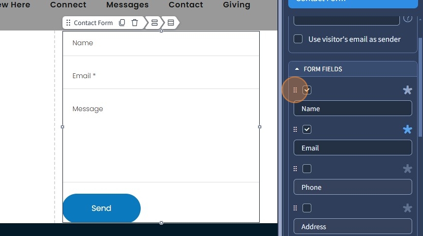
Form Fields
5. The Form Fields section is for adding the necessary fields to the Contact Form. Select the necessary fields with checkboxes next to them.
The following form fields can be added - Name, Email, Phone, Address, Subject, Attach File, Message, Agreement.

6. You can deselect/remove unnecessary fields with the checkboxes

If you have previously enabled "Use visitor's email as sender", it will be impossible to deselect/remove the Email field since it's required in this case
7. Click the '*' icon to make a field required. The visitor will not be able to submit information through the contact form unless the required field is also filled in.

8. You can change the order of the Form Fields by holding the left mouse button on the 6 dotted icon and dragging a Form Field above or below.
9. If needed, click on the Form Field itself to rename it to something else. The type of input the visitor will enter in these fields after you rename them will be the same regardless (text for text fields, email for email field, numbers for phone field).

10. Select the "Agreement" checkbox to add an agreement field to the contact form. The visitor will be able to acknowledge and accept the Terms and Conditions of your website before proceeding with its use.

11. Click the pencil icon to customize the Agreement field.
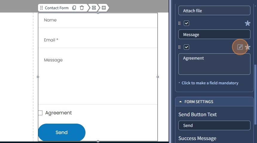
12. Type text for the Agreement field without Text Editor enabled. The Text Style that is used in this case can be found in Contact Form > Design.

13. Alternatively, turn on the "Enable Text Editor" to edit the Agreement field with the Text Editor. Use additional options besides Text Styles, such as alignment, adding a link to text, etc.

14. Click "Apply" to confirm the changes in the Agreement field.

15. Click "Save" at the top right corner to confirm the changes

16. This is an example of how it will look after editing the Agreement field with the Text Editor.

Form Settings
17. The Form Settings section is mostly for changing the text of success and the error status messages. Regardless of what you type, you can only change the context of the original messages. The purpose of each field will still be the same.
The following fields can be renamed: Send Button Text, Success Message, Error Sending, Mandatory Field Error, Email Field Error.

18. Select the "Make Form Inline" checkbox in case you want to make the Contact Form horizontal

Please be aware that these changes may negatively affect the contact form design
19. This is how it will look after you enable it

20. Unselect the devices where the Contact Form should not be inline. You can also specify the spacing between inline elements (0, Small, Medium, Large) and vertical alignment (center, top, bottom) for the inline Contact Form.

21. Click "Save" to confirm the changes.

Action After Form Submission
22. The contact form can be linked to 5 different groups of features after form submission - Action, Blog, Events, Small Groups, and Sermons. Select the required action to link to.

23. The Actions are: None, Go to Page, Open Popup, Open URL, Open in Lightbox
None - will lead nowhere;
Go to Page - this will lead to a specific page.
Open Popup - will open a popup window.
Open URL - will lead to an external website.
Open in Lightbox - will open the image in Lightbox effect, filling the screen and dimming out the rest of the web page.
Blog, Events, Small Groups, and Sermons can all be linked to their Home Page and their Post in the Contact Form.
24. Select the "Reset Form" checkbox so that the entered data is cleared from the Contact Form after it is submitted

25. Now, you have a contact form with an action after form submission. Click "Save" to confirm the changes

The rest of the features here - Spacing, Visible On, and Animation are common features in most widgets in the website builder. Please refer to this guide for more information on these features.
Design tab
26. Switch to the Design tab

27. Specify a Preset for the Contact Form. Presets are predefined designs that allow users to quickly apply a specific style or layout to a widget. You can customize the preset style in the Design section
Specify a Checkbox Text Style. Text Styles are used to create consistent and reusable formatting for text across the website. Check this Text Styles overview guide for more information

If you have previously set a Text Style for the Checkbox Text in the Text Editor for the Contact Form, it will overwrite the Checkbox Text Style you're trying to apply since a Text Style has already been set via the Text Editor.
28. Specify the Send Button Preset, its size (small, medium, large), and its alignment. Additionally, you can specify the preset for the Attach Button (if the attach file form field is enabled) and the size for it

29. Click "Save" to confirm the changes
