
1. The Text Widget allows you to add and format text content on your website with the Text Editor. It can be used for headings, paragraphs, and lists, with options to customize fonts, colors, alignment, and styles. Drag and drop the Text Widget on the page.

Other widgets that allow captions, for example, Slider, Carousel Slider, and Tile Gallery also have a built-in Text Editor in them so you can format the caption to your needs.
2. Left-click the Text Widget twice to start editing it. You can start typing text and use the Text Editor features, which we will examine in Step 3 and further.

The properties in the Text Widget - Spacing, Visible On, and Animation are common features in most widgets in the website builder. For more information on common features, please refer to this guide
Text Style dropdown
3. The Text Style dropdown lets you apply a predefined style to your text. To make changes, highlight or click on the text.
Text Styles ensure consistent formatting across your website. Learn more in this guide.

Text Options
4. Highlight the text and choose from the available options to make it bold, italic, underlined, strikethrough, ₁subscript, or ²superscript.
- Bold – Makes the text appear thicker and more prominent.
- Italic – Slants the text for emphasis or stylistic purposes.
- Underline – Adds a line beneath the text.
- Strikethrough – Draws a line through the text to indicate deletion or correction.
- Subscript – Lowers the text slightly below the baseline, often used for chemical formulas (e.g., H₂O).
- Superscript – Raises the text slightly above the baseline, commonly used for exponents (e.g., 10²).

Text Alignment
5. You can adjust the alignment of your text by clicking on the text and selecting one of the alignment options: Left, Center, Right, or Justify.
Here’s what each alignment does:
- Left Align – Aligns the text to the left margin, leaving uneven space on the right.
- Center Align – Positions the text in the middle, creating equal space on both sides.
- Right Align – Aligns the text to the right margin, leaving uneven space on the left.
- Justify – Spreads the text evenly across the width of the container, aligning both the left and right edges.

Hyperlink options
6. Highlight the text and click on the Link icon to include a hyperlink in the text.
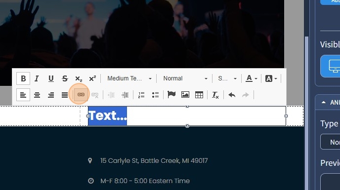
7. Select a required action to link to. For example, Open URL.
Specify the URL, specify if it should open in new browser tab or current browser tab, and specify if it needs to be a no-follow link and click "OK".

8. You can remove the link by clicking the "Unlink" icon.

Remove Format
9. To remove any applied formatting from the text, highlight the text and click the Remove Format icon.

Paragraph Format
10. The Paragraph Format option in the Text Widget allows you to structure your text using different formatting styles. You can highlight or click on the text and select one of the following formats:
- Normal – Standard paragraph text used for body content.
- Heading 1 – The largest and most important heading typically used for main titles.
- Heading 2 – A slightly smaller heading, often used for section titles.
- Heading 3 – A medium-sized heading for subsections.
- Heading 4 – A smaller heading for minor subsections.
Using Paragraph Formats helps maintain a clear hierarchy and improves readability and SEO.

When you remove formatting and apply Heading 1, Heading 2, etc., the text size increases due to predefined font sizes and spacing. However, if a Text Style is already applied, only spacing is adjusted because the Text Style overrides the default heading size. This ensures consistency across the website while preserving the heading structure.
Indent options
11. The Indent options let you adjust text indentation. Click or highlight the text and use Increase Indent to shift it 40 pixels to the right. Click Decrease Indent to reduce or remove the indent, improving text placement and readability.

Numbered and Bulleted Lists
12. The Numbered and Bulleted Lists options let you organize text with numbers or bullets. Highlight or click the text, then use the Insert/Remove Numbered List or Insert/Remove Bulleted List icons. Click again to remove the list formatting.

Font Size
13. The Font Size feature allows you to adjust the size of the selected text. To use it, highlight the text and choose the desired font size from the dropdown. The maximum font size you can select is 72 pixels. This sets a fixed font size for your text across all screen resolutions.

If you don’t need a fixed font size, set a font size for each screen resolution in Design → Text Styles. See this guide for details.
Undo/Redo
14. The Undo icon lets you reverse the last change you made to the text, while the Redo icon restores a change if you undo it by mistake.

Inserting Icon
15. To insert an icon, first, click on the text where you want the icon to appear. Then, click on the Insert Icon option and choose an icon from the available selection.
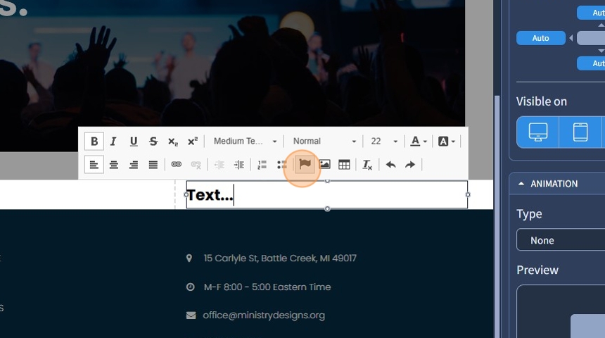
16. You can use the search bar to quickly find a specific icon or browse manually. After selecting an icon, choose a variant, if needed, such as different rotations or a spinning effect. If you want the icons to align properly in a vertical list, you can enable the "Set fixed width for the icon" checkbox. Click "Apply".

17. This is how it will look as a result. The text has an icon now.

Inserting Image
18. To insert an image, click on the text where you want the image to appear. Then, click the Insert Image icon and choose an image from the Media Library.

19. Click "Apply" to confirm your selection.

20. The Edit Item window will open, allowing you to customize the image. You can set a Title, alt text, Spacing, Float (Not Selected, Left, Center, Right), Vertical Alignment, and the Width and Height of the image. Then click "Apply."

21. This is how it will look with the Float (Not Selected). The Float option controls the alignment of an image within the text. It allows you to position the image relative to the text by selecting:
- Not Selected: The image stays within the text block, aligned according to default settings.
- Left: The image floats to the left, and the text wraps around it on the right.
- Center: The image is centered within the text block, with no wrapping.
- Right: The image floats to the right, and the text wraps around it on the left.
This feature helps control the flow and layout of text and images within the Text Widget.

Table
22. Click the Table icon to add tables within the text. Clicking the Table icon opens the Table Properties window, where you can configure the table before inserting it.

23. Table Properties:
- Rows & Columns: Set the number of rows and columns.
- Headers: Choose to style the First Row, First Column, or both as headers.
- Preset Name: Select a predefined style (Preset 1, Preset 2, or Preset 3).
- Additional Options:
- Add Stripes: Alternates row colors.
- Add Hover Effect: Highlights rows on hover.
- Compact Style: Reduces spacing for a tighter layout.
After setting the properties, click "OK" to insert the table. You can adjust it further after insertion.

Text Color
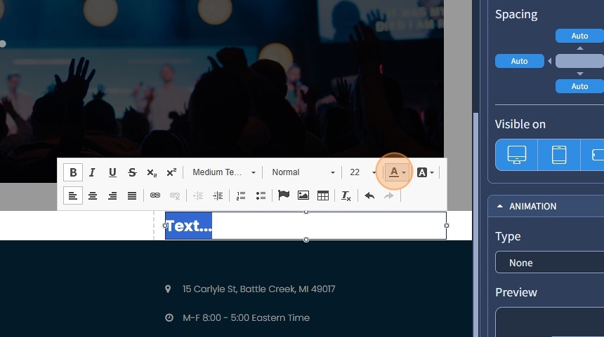
24. Highlight your text and click the Colors icon to change the color of the text. If you need a specific color, click More Colors to use the Color Picker
Background Color
25. Highlight your text and click the Background Color icon to change the background color of the text. If you need a specific color, click More Colors to use the Color Picker

26. Click "Save" to confirm the changes.
