
1. A slider is a widget that displays a series of images one at a time, with a transition effect like sliding or fading. Users can navigate through the items manually, or the slider can change them automatically after a set time interval. It's commonly used to showcase featured content, images, or promotions. Drag and drop the Slider widget on the page

2. Left-click the Slider widget to edit the Settings described in Step 3 and further

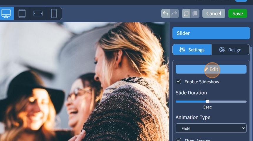
3. Left-click the Slider widget twice or click "Edit" to prompt the window from Step 4

4. Click "Add Images"

5. Select images for the Slider from the Media Library

Make sure that the images have the same aspect ratio. When all images have the same aspect ratio, the slider looks neat and organized. This uniformity makes the website appear more professional and aesthetically pleasing.
You can select several images for the Slider from the Media Library by holding the Ctrl button on the keyboard and left-clicking once on each image.
6. Click "Apply" to add the required images to the Slider

7. Click "Apply" again to confirm the selected images

8. Enable or disable the slideshow with the "Enable Slideshow" checkbox
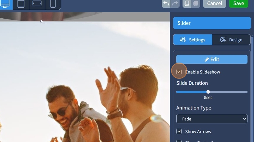
9. Set the slide speed with "Slide Duration"

10. Select from the "Animation Type" dropdown sliding or fading animation for the Slider

11. Enable or disable the arrows in the slider with the "Show Arrows" checkbox

12. This is how they look on the page. These arrows help users easily browse through the content in the slider.

13. Enable or disable the pagination with the "Show Pagination" checkbox

14. This is how it looks on the page. It visually shows how many images are in the Slider and which image is currently being viewed.

15. Enable or disable the thumbnail pagination with the "Thumbnail Pagination" checkbox.

16. This is how it looks on the page. Thumbnail pagination displays small previews of all images, making it easy to jump directly to any image in the Slider.

17. Select a device resolution that should have a different alignment for thumbnail pagination.

18. Set a different thumbnail alignment

19. If needed, it can be reset back to the inherited value by clicking the arrow

20. "Visible Thumbnail Pagination on" is the same feature as "Visible On". For more information on the Visible On feature, please refer to this guide

21. "Visible Caption on" is the same feature as "Visible On".

22. To add a caption, left-click the Slider widget twice or click "Edit"
23. Click on a pencil icon to edit an image in the Slider

24. Type the text for the caption in this text field to have a caption with a predefined Text Style

25. Specify an Alt Text for the Slider image.

The Alt Text provides alternative information for an image if a user for some reason cannot view it (because of a slow connection or if the user uses a screen reader). Please refer to this guide on how to adjust the SEO settings
26. Alternatively, turn on the "Enable Text Editor" toggle for editing the caption with the Text Editor

27. Use the Text Editor for more detailed editing of captions. Use additional options besides Text Styles, such as alignment, adding a link to text, etc.

28. Click "Apply" to confirm the changes to the image

29. Click "Apply" again to confirm these changes to the image in the Slider

30. Click "Save" for the changes to take effect on the page

31. This is how it will look on the page preview. The caption is using Text Style from the Text Editor

The rest of the features here - Spacing, Visible On, Animation, and Design - Preset are common features in most widgets in the website builder. Please refer to this guide for more information on these features.