
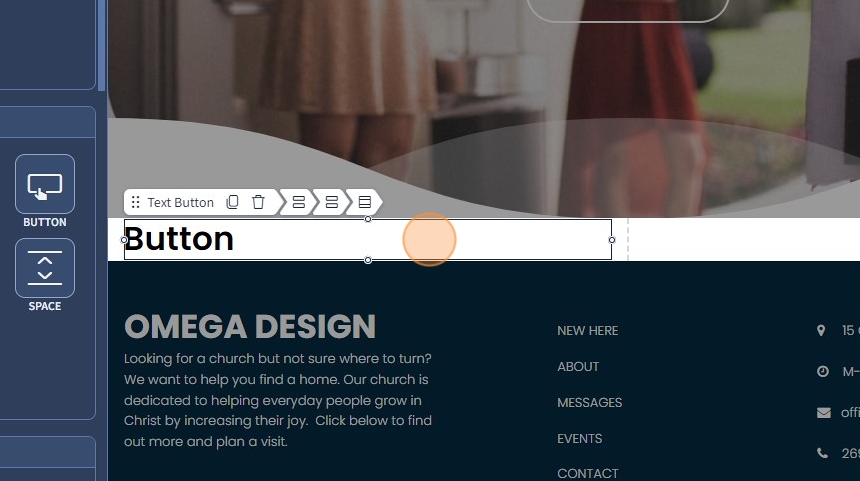
1. The Text Button is a button widget without any background color or borders. You can use this button instead of the default Button widget. Drag and drop the Text Button widget on the page.

2. Left-click the Text Button widget to edit the Settings described in Step 3 and further
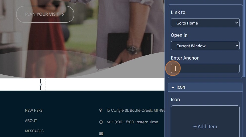
3. Select from the dropdown where to link the Text Button. After clicking, it can lead to a page or specific page section or an action, such as "Mail To," "Call To," or "Open File." Please refer to the following guide, which explains in broad detail how the Link To feature works.

4. If needed, specify an anchor in the "Enter Anchor" field.
5. Click on the shapes icon to select a Font Awesome icon for the Text Button

Font Awesome is a popular icon library that provides a collection of scalable vector icons that can be easily customized with CSS. It allows web designers and developers to add icons to their websites without creating or using image files.
6. Select the necessary Font Awesome icon for the Text Button

7. Click "Apply"

8. This is how it will look on the page

9. Specify a position for the icon in the Text Button widget. You can choose the left or right.

10. Select from the dropdown a spacing between the icon and the Text Button. 0, Auto, Small, Medium, and Large spacing is available.
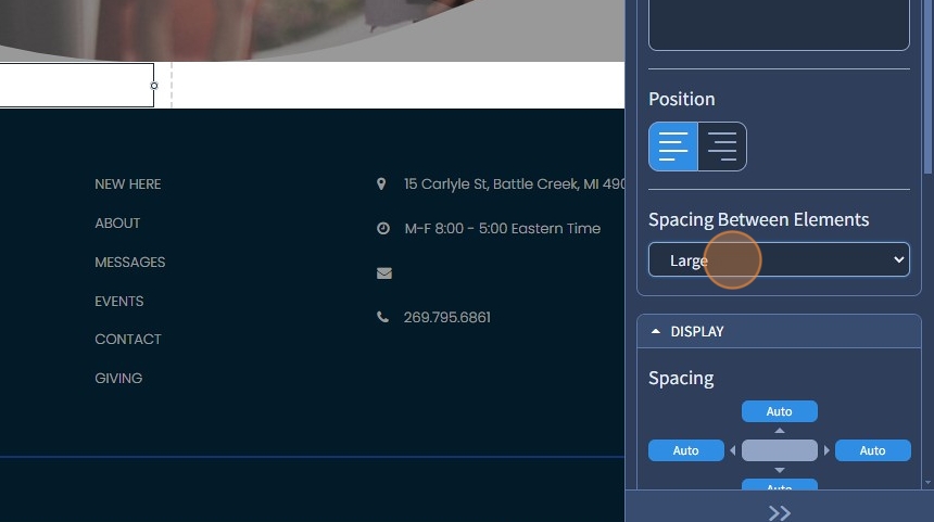
11. This is how the distance will look if the "Large" spacing is set

12. Now you have a Text Button with a Font Awesome icon. Click "Save"

13. If needed, you can change the icon to another or delete the one you have selected by clicking on the pencil or bin icons, respectively

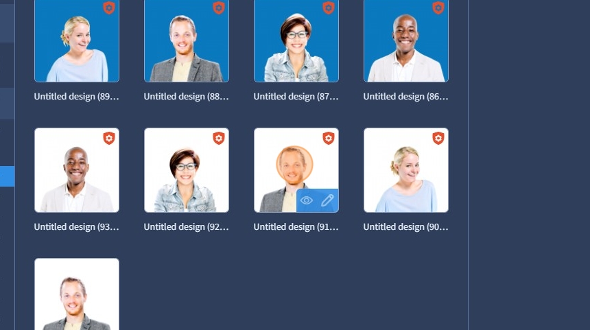
14. Click on the image icon to select an image for the Text Button

15. Select the required image
16. Click "Apply" to confirm the image you have selected

17. This is how it will look on the page

18. Specify a position for the image in the Text Button widget, you can choose left or right.

19. Select from the dropdown a spacing between the image and the Text Button. 0, Auto, Small, Medium, and Large spacing is available.

20. This is how the distance will look if the "Large" spacing is set

21. Now you have a Text Button with an image. Click "Save"

The rest of the features here - Spacing, Devices, Alignment, Visible On, Animation, and Design - Text Style are common features in most widgets in the website builder. Please refer to this guide for more information on these features.