
1. A carousel slider is a widget that has a rotating display of images that users can navigate through by clicking on arrows or dots. It often shows one or a few items at a time and cycles through multiple items, either automatically or when prompted by the user. This type of slider is commonly used to showcase featured products, images, or articles in a visually engaging way. Drag and drop the Carousel Slider widget on the page

2. Left-click the Carousel Slider to edit the Settings described in Step 3 and further

3. Left-click the Carousel Slider widget twice or click "Edit" to prompt the window from Step 4

4. Click "Add Images"

5. Select images for the Carousel Slider from the Media Library

Make sure that the images have the same aspect ratio. When all images have the same aspect ratio, the carousel slider looks neat and organized. This uniformity makes the website appear more professional and aesthetically pleasing.
You can select several images for the Carousel Slider from the Media Library by holding the Ctrl button on the keyboard and left-clicking once on each image
6. Click "Apply" to add the required images to the Carousel Slider

7. Click "Apply" again to confirm the selected images

8. Specify width with "Slide Width"

9. Specify the minimum number of visible slides in the Carousel Slider with "Min Slides"

10. Specify the maximum number of visible slides that can be shown in the Carousel Slider with "Max Slides".

Both "Min Slides" and "Max Slides" values can be set from 1 up to 30
11. Select from the "Switch Slides" dropdown if slides need to be switched one by one or as group slides.

12. Use the Margin to increase the spacing between each slide

13. Enable or disable the slideshow with the "Enable Slideshow" checkbox
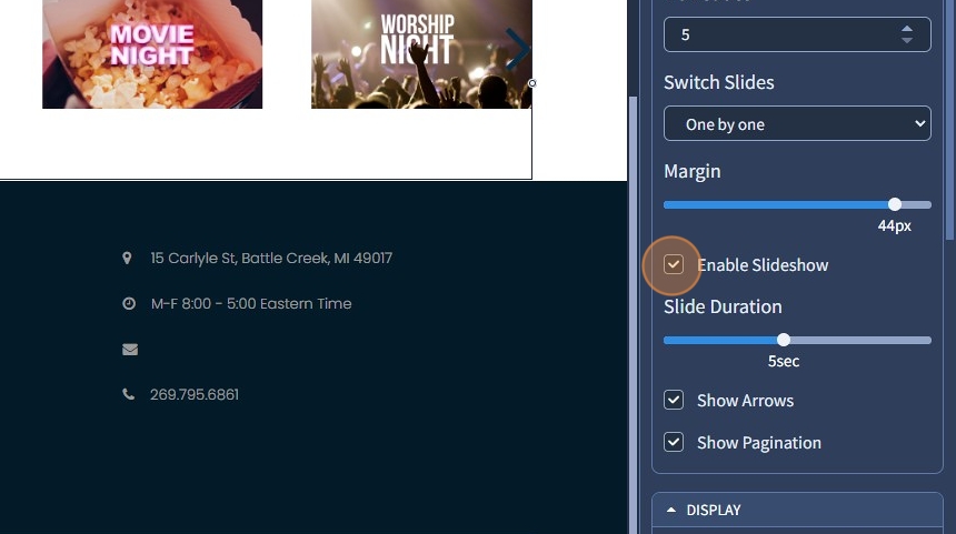
14. Set the slide speed with "Slide Duration"

15. Enable or disable the arrows in the Carousel Slider with the "Show Arrows" checkbox

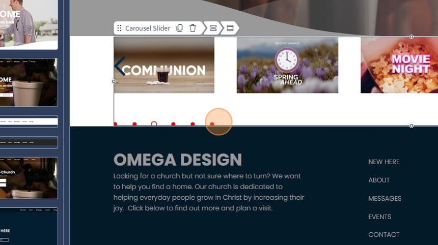
16. This is how they look on the page. These arrows help users easily browse through the content in the slider.

17. Enable or disable pagination in the Carousel Slider with the "Show Pagination" checkbox

18. This is how it looks on the page. It visually shows how many images are in the Carousel Slider and which image is currently being viewed
19. To add a caption, left-click the Carousel Slider widget twice or click "Edit"

20. Click on a pencil icon to edit an image in the Carousel Slider

21. Select from the dropdown where to link the Carousel Slider image. It can lead to a page/specific page section or an action, for example, "Mail To", "Call To", or "Open File" after it is clicked. Please refer to the following guide that explains in broad detail how the Link To feature works.
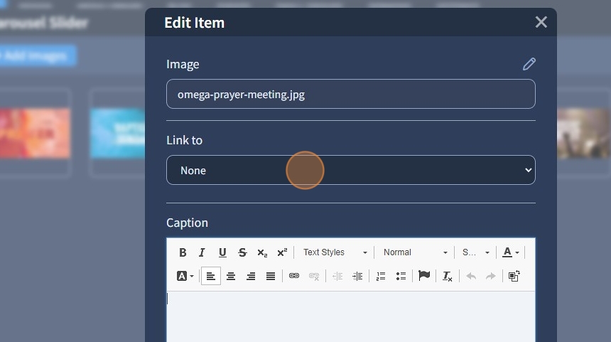
22. Use the Text Editor for detailed editing of the caption. Use additional options besides Text Styles, such as alignment, adding a link to text, etc.

23. Specify an Alt Text for the Carousel Slider image.

The Alt Text provides alternative information for an image if a user for some reason cannot view it (because of a slow connection or if the user uses a screen reader). Please refer to this guide on how to adjust the SEO settings
24. Click "Apply" to confirm the changes to the image

25. Click "Apply" again to confirm these changes to the image in the Carousel Slider

26. Click "Save" for the changes to take effect on the page

27. This is how it will look on the page preview. The caption for the Carousel Slider has been edited with the Text Editor

The rest of the features here - Spacing, Visible On, Animation, and Design - Preset are common features in most widgets in the website builder. Please refer to this guide for more information on these features.