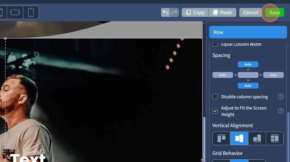
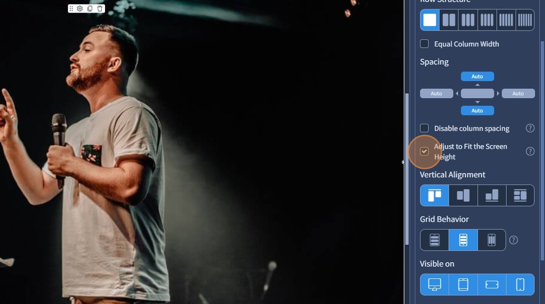
1. "Adjust to fit the screen height" makes the Row, Container, or Block fill the entire visible screen height, regardless of the device or screen size. This helps create full-screen sections, commonly used for banners or key content areas. Select the Row Widget

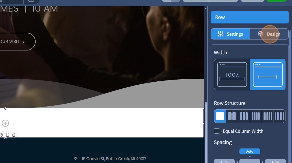
2. Switch to the Design tab
3. Click "+" to add a background image
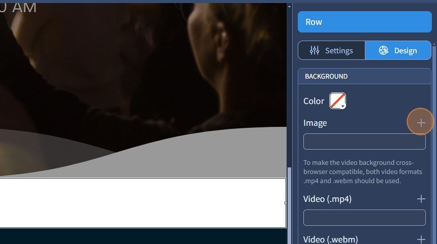
4. Select the required image and click "Apply"

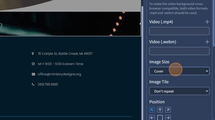
5. Specify Image Size. Image size controls how the image fits within the Row/Container/Block widget
- Original – Displays the image at its original size.
- Cover – Scales the image to cover the container fully while maintaining the aspect ratio.
- Contain – Scales the image to fit within the container without cropping.
6. Switch back to the Settings tab

7. Select the "Adjust to Fit the Screen Height" checkbox.
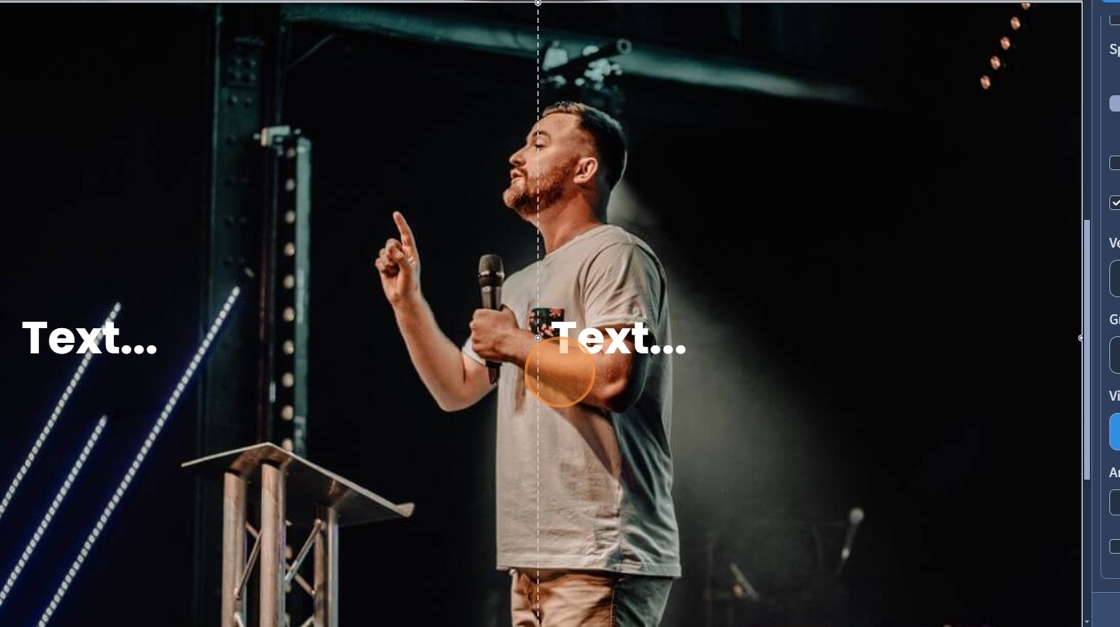
8. If needed, divide your Row into several columns

9. Drag and drop the Text widget into the columns

10. Specify the Vertical Alignment (top, center, bottom, justify) for the Row content
- Top – Aligns content at the top.
- Middle – Centers content vertically.
- Bottom – Aligns content at the bottom.
- Justify (space between) distributes them with equal space in between without stretching the elements themselves.

11. The Text Widget is in the middle as a result
12. Click "Save" to confirm the changes