
1. Unlike the regular Image widget, the Advanced Image widget includes hover effects, animations, and different proportions. This allows you to make the website more unique. Drag and drop the Advanced Image widget on the page.

2. Select the Advanced Image widget.

Settings tab
3. Click "+" to add an image from Media Library.

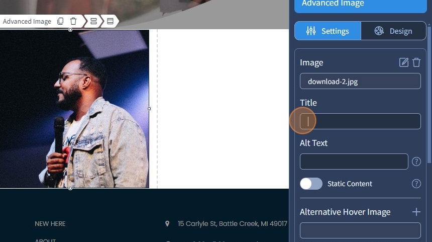
4. Specify the image title. Additionally, you can specify alt text for the image. Visitors will see this text if the browser blocks the ability to preview images. This feature also makes your image screen reader complaint.
5. Enable Static Content. This mode allows you to display static text on the image. Due to the static nature of the text, hover options will be limited.

Proportions
6. Select a proportion for the image. The following proportions are available: 1x1, 3x4, 9x16, 1x2, 4x3, 3x2, 16x9, 2x1
Additionally, use the Link To dropdown to link the Advanced Image. Please refer to the following guide that explains in broad detail how the Link To feature works.

Settings - Normal State
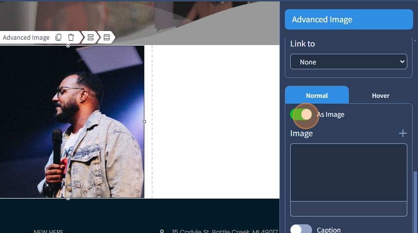
7. Select the normal state for the Advanced Image.

8. Use the toggle button to add an image on the Advanced Image. If it is turned off, you can add an icon instead. Click "+" to add an image or an icon.
9. If needed, you can delete or change the image or the icon with the bin and pencil icons, respectively.

10. Enable caption in Normal state for the Advanced Image. Click the pencil icon to edit the caption.
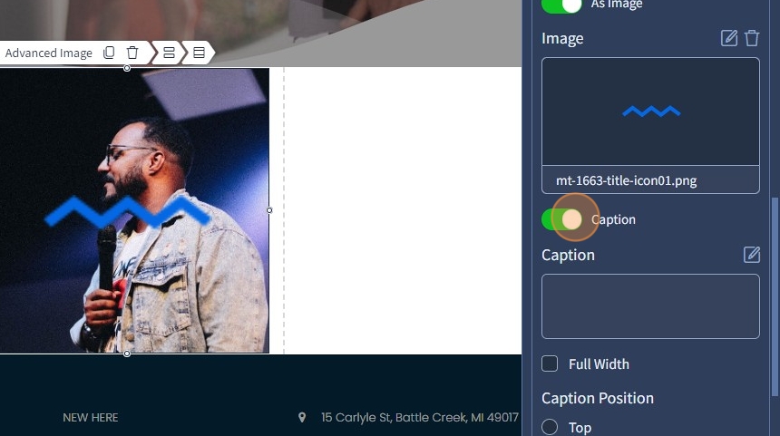
11. Use the Text Editor to edit the caption. For more information on the Text Editor, please refer to this guide. Click "Apply" to confirm the changes.

12. Enable full width with the corresponding checkbox for the caption. The caption will take the full width of the image.
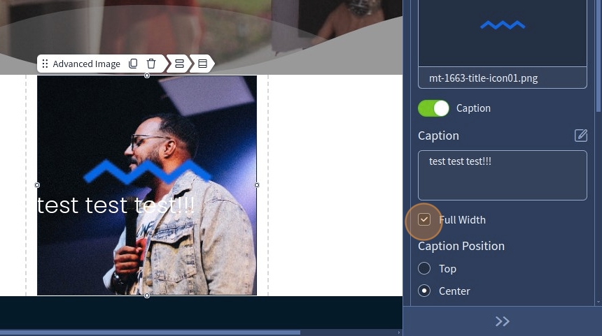
13. Choose the caption position. It can be on the top, center, or bottom. Specify caption spacing.

Alternative Hover Image
14. Click "+" to select alternative hover image from Media Library.

15. Specify the Alternative Hover Image title. Additionally, specify the alt text for the image. Visitors will see this text if the browser blocks the possibility of previewing images.

16. Select the rotate animation for flipping images.

17. Select the horizontal axis of rotation for flipping the images vertically. Alternatively, you can select the vertical axis of rotation for flipping the images horizontally.

18. Select the blur animation for flipping images. Specify how deep the blur should be in pixels.

Settings - Hover State
Hover State in the Settings has the same functionality as Normal State with only one exception. There is a checkbox that allows you to copy the caption from the Normal State.
19. If there's no alternative hover image, the hover effect will be applied to the main image. A hover caption will also be applied to the main image as a result.

20. Enable using of content from normal state with the corresponding checkbox to copy the caption from the Normal state.

The remaining features here - Spacing, Visible On, and Animation are common features in most widgets in the website builder. Please refer to this guide for more information on these features.
Design tab
21. Switch to the "Design" tab.

22. Specify the transition time, which can be set from 0 seconds to 3 seconds.
Select a device that should have a different icon size. Please refer to this guide for more information on Devices
Set the mini-image/icon size on different devices. This will affect both Advanced Image and Alternative Hover Image at the same time.

Design - Normal State
23. Select Normal state for the Advanced Image.

24. Use the Color Picker to select the overlay color for the Advanced Image. For more information on how to select a specific color, please refer to this guide.
Additionally, select a caption background color for the Advanced Image.

If you have an icon for the caption, you can also change the icon color
Effects
25. You can set the following effects: Scale, Blur, Grayscale, Opacity
Scale - enlarges or shrinks the image (it can be set from 0.5 to 1.5);
Blur - softens the image, making it less sharp;
Grayscale - converts the image to black and white, this will only work if there's no overlay color set in the first place;
Opacity - adjusts transparency, making the image more or less visible.

26. Specify the corners for the image. The image will have rounded corners.

27. By default, the shadow is set to "None". Specify the shadow outset for the Advanced Image.

28. Specify the X offset, Y offset, blur, and spread for the shadow.

29. Select the color of the shadow. The Advanced Image has a shadow now. Please refer to this guide for more information on how to set a specific color.

Design - Hover State
The Hover State in Design has the same functionality as the Normal State, be it an Advanced Image with or without an Alternative Hover Image.
30. Click "Save" to confirm the changes.
